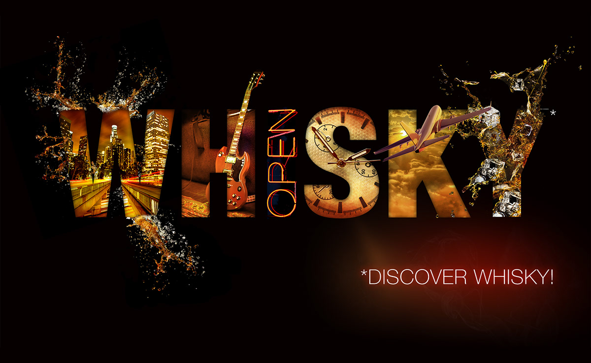
A design of a Key Visual image for the Diageo Marketing Strategy 2014 in Moscow. The image was used for in-store advertising and supermarket pallet displays.
Whisky is a complicated and cluttered category. Many brands are understood as a commodity with lots of deep discounts driven by Low Standard segment. The features and values of segments are blurred and shoppers can’t find the reason to pay more for Standard+ Whisky. The main goal was to deliver a big idea of modernity, coolness, and status of Standart+ Whisky category thru emotions and premium elements in Key Visual, copyline and in-store solutions.
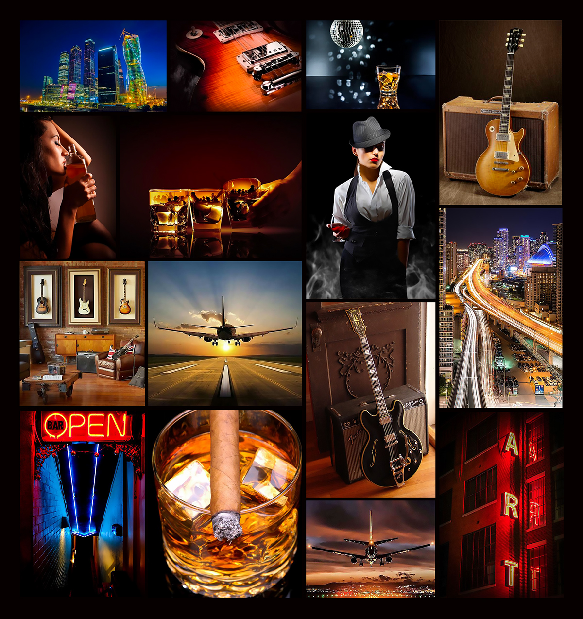
ATTRIBUTES AND MOODBOARDS
I started a creative work from a deep understanding of the product. The general question I asked was: What was the client expecting to get? A client already had an idea how it would look like, but didn’t know how to reach it.
The task was to make the “fine tuning” showing the richness of Whisky attributes: status, coolness, modernity, vibrancy. The outcome must be breathtaking, inspiring, engaging and unlock the true attributes of Whisky category stated above. Pure awesome! Gathered product attributes and moodboards worked well for this task.
WORK PROCESS
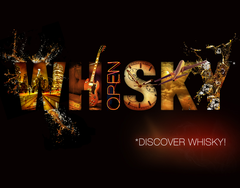
Next step was drawing sketches and creating a design of key visual. The concept began with the word “WHISKY”, then it started gaining details. Each letter reflects the features and values of the product and link to the progressive premium perception. It is as if Key Visual is saying: Whisky is a really cool, status and stunning drink!

COPYLINE AND FINAL RESULT
After the design of Key Visual was finished and approved, I started thinking about a copyline. It should contain “call to action” and drive the shopping intention. After some long discussions, I and the team decided to choose “Discover Whisky”. This is what the final result is!
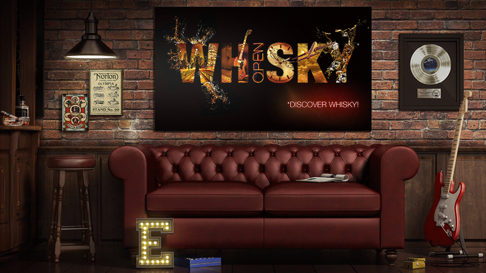
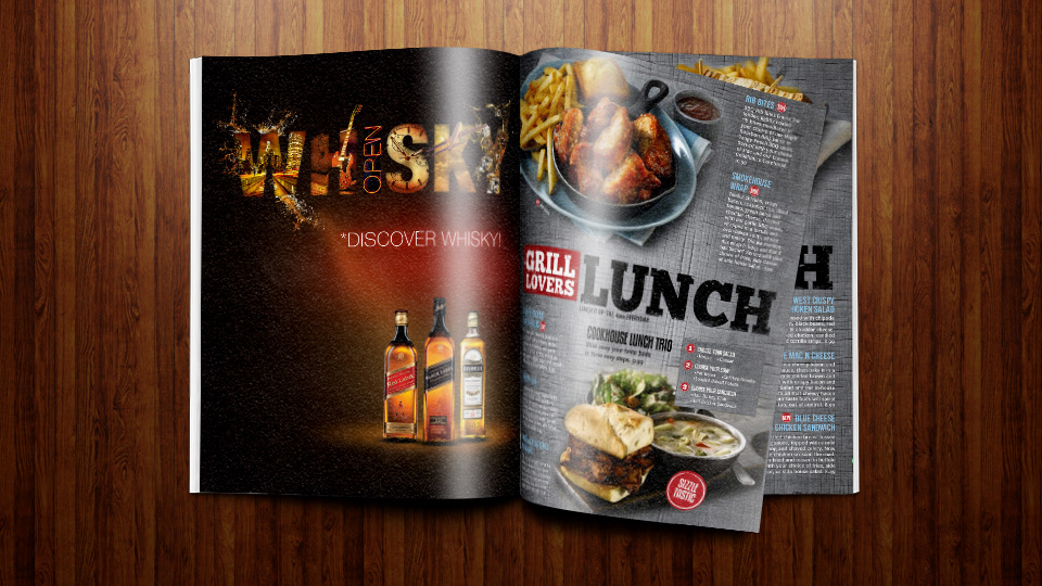
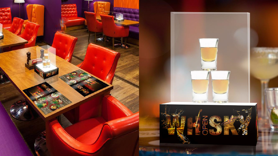
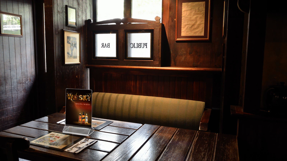
PRINT & IN-STORE ADVERTISING
In-store promotions are a highly effective marketing tactic, designed to bring customers to your product. In-store promotions can be advertised through many different channels, but every distribution method will usually fall into one of two categories: Print and Point-of-sale (POS) Advertising. Each type of advertising can be used to draw traffic and build brand awareness to your business. For Diageo Marketing Strategy, I’ve designed posters, a magazine advertisement, table tents, etc.
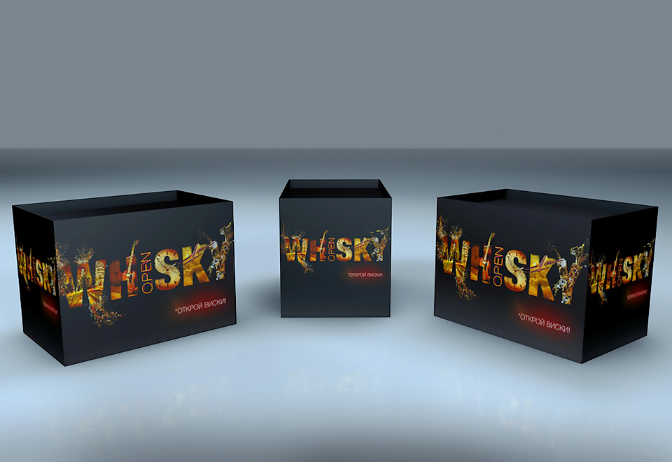
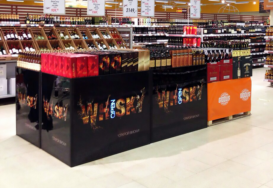
SUPERMARKET PALLET DISPLAYS. REGULAR DISPLAYS
The primary goal was to place the Key Visual on the Supermarket Pallet Displays. There were two types of Pallet Displays: Regular Displays and Non-standard Displays. On the images are showed 3D renders and photos of Regular Single and Regular Composition Displays.
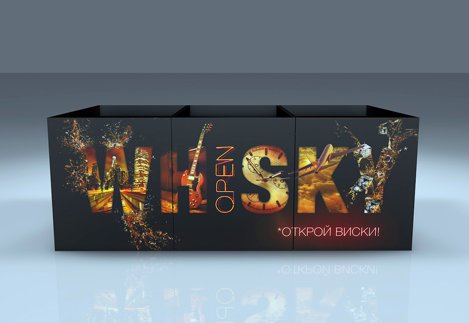
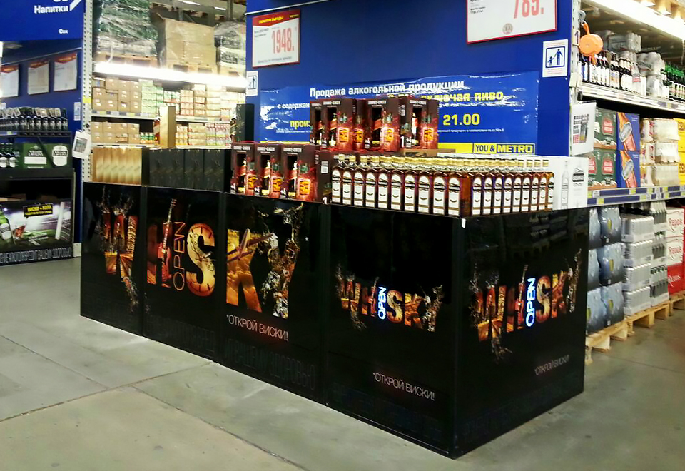
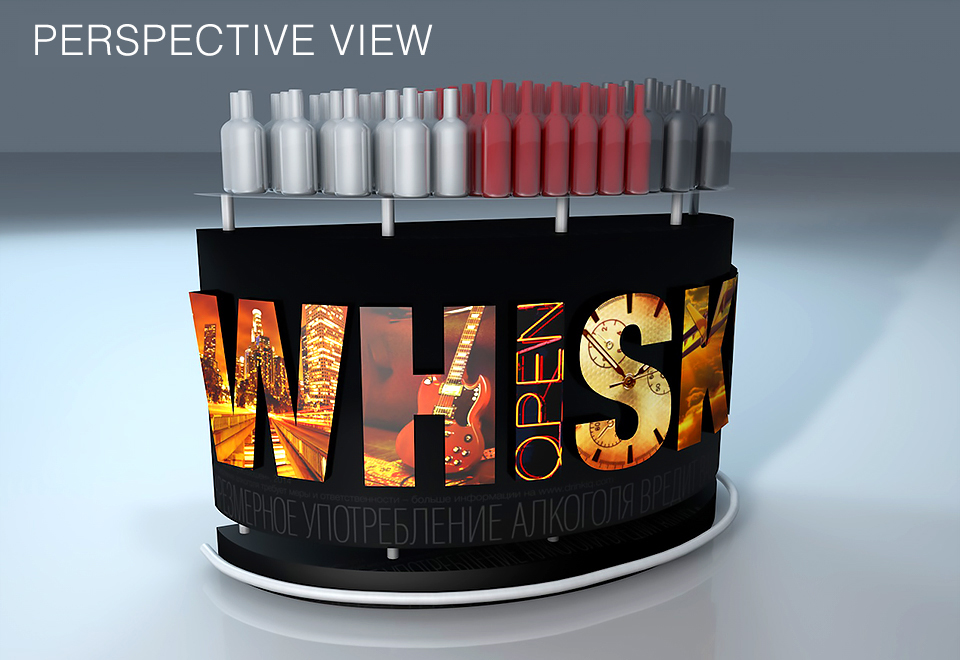
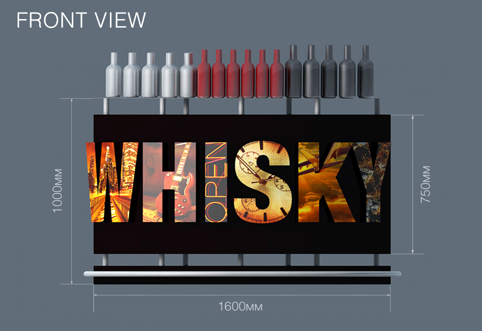
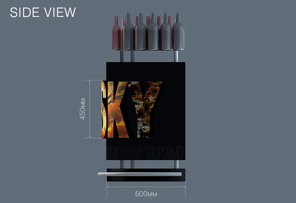
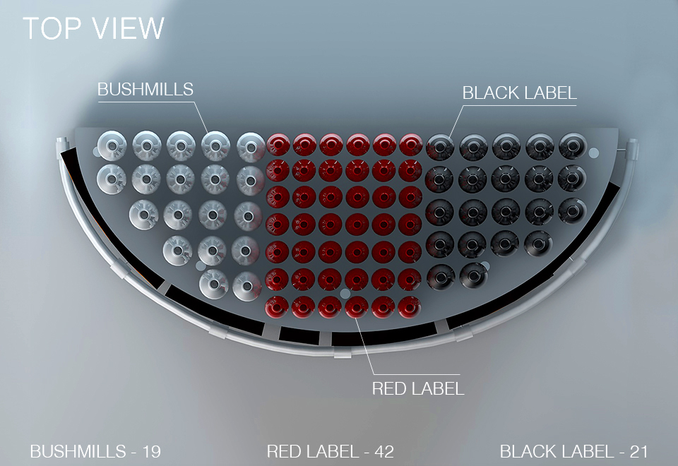
NON-STANDARD DISPLAYS
To develop the Non-standard Displays I needed more time and creativity. The main idea was to create the eye-catching and outstanding shape of the pallet. It was not enough to place the Key Visual, I needed to visualize the Key Visual. So it was: The Pallet Display with a convex shape and volumetric light letters. On top, there was a glass shelf for placing the bottles.